
Brighton’s Arty: I shot the serif
Two fonts walk into a bar.
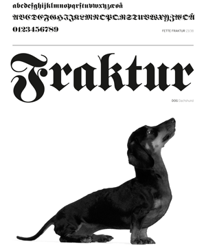
The barman says: “Sorry, we don’t serve your type here.” Couldn’t resist. The Dane trained as a typographic designer, and an inordinate amount of time is spent discussing the merits of serif vs sans. A few years ago, when we were preparing for Artists Open Houses, we had the genius idea of creating a series of artworks inspired by fonts reminiscent of cats and dogs – and we called it the ‘Alphapets’. Who could resist? Well, just about everyone traipsing around the Central Trail. We’d made that age-old mistake of appealing to too niche a market – Brighton based, animal loving, typographic designers. I know one. And I’m living with him and a loft full of expensively reproduced, unwanted Alphapets, which are gradually being rehomed on our printer Dominic’s office walls each Christmas. (“A Basset Hound that looks like Burlington? To go with the Persian puss that looks like Arab Dances? You really shouldn’t have …”)
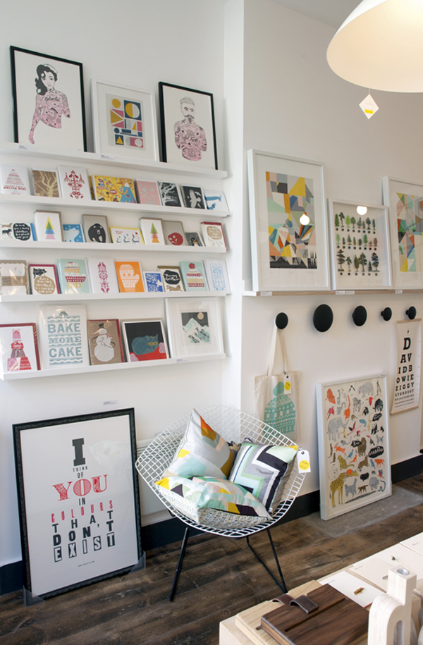
Fortunately, there are plenty of brilliant examples of typographic art that will appeal to just about everyone to be found locally. And you couldn’t ask for a better collection than Unlimited’s on Church Street in the North Laine. This independent design shop, gallery and studio showcases prints by an exciting and ever-expanding collective. It’s masterminded by husband and wife team Patrick and Sara Morrissey, who’re passionate about sourcing a great selection of affordable and innovative work. It’s a beautiful, unique artspace. Go see!
Coming up: At The Grange, Rottingdean, Jill Tattersall and Gail Gibson Tait’s new exhibition ‘Sense & Serendipity’ is a collection of paintings that truly seize the moment. Jill’s sensitivity to colour – intense and glowing yet still subtle – is remarkable. Don’t miss. From 23 October to 4 November. www.artymagazines.com
Alison Krog
Follow us: @brightonsarty