Robert Nemeth on where we live in Hove

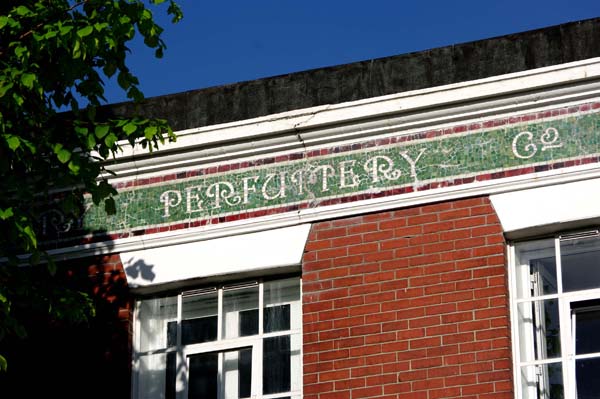
In the spirit of the Brighton Festival, DK Architects have released the second poster in a series of photo-montages of architectural features – called Where We Live in Hove – to really get people thinking about what makes their area great.
DK Architects are situated on Hove Park Villas in a former wine merchant’s premises just above Hove Station, which also is the home of the firm’s founder, David Kemp. Readers might recall David’s work in proposing a new footbridge for the station. He clearly loves the area in which he both lives and works.

The posters, currently on display in DK’s window, feature a selection of photographs of what David sees as the best bits of his area – the bits that pedestrians with a keen eye might smile about to themselves as they walk by, or point out to their friends from other parts of the city.
“Builders were still providing the details that we love…”
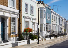
The area above Hove Station and below the Old Shoreham Road has no particular name but could loosely be described as the Wilbury district. The streets are generous in width and the houses are Victorian and Edwardian. This was a golden age for building in Hove. Builders were still providing the details that we love, and construction quality was at its peak.
The Wilbury district is defined by all manner of things to different people. For those interested in architecture, there are geometric tiles galore. There is no Regency render but, instead, solid red and white brick. Gateposts and porches are adorned with terracotta. Whether it be Wilbury Gardens (one of the best roads in Hove) or Ranelagh Villas, not one of the roads is bad.
I tend to rattle off the same short list of decent modern buildings locally when called upon and each has the modern equivalent of the features that David has identified. In Brighton, the Jubilee Library’s oily-black mathematical tiles certainly cannot be bought off the shelf in Wickes, nor can the delightful copper roof of Medina Studio on the Hove seafront. What is sad is that few modern developments present us with the same opportunities for joy as we walk around.
A fundamentally sound design, along with bespoke ingredients, really do make these buildings – but the point is really that some of their best bits can be seen by anybody that walks past, just as David’s posters can be too which will be for sale over the coming weeks.
www.buildingopinions.com
robert@buildingopinions.com
Follow me: @robert_nemeth


