


Latest Interiors goes retro with paint
Paint – colour and type – is the foundation of interior design. The colours and textures you use to decorate have a direct visual impact that will affect the look, feel and overall impression of a space. Exterior colour can also make a huge impact – making your home stand out, blend in, or simply seem immaculately finished. This week, Latest Interiors takes a look at the new ways to colour your home beautiful.

Beauty is on the inside
The secret to a good coat of paint lies in the preparation: cleaning, making good any problem plasterwork, and sanding down woodwork. And it’s worth taking the time to do it well, if you want your finish to last – paint works best on walls that are in good condition. If the plaster work is a little ropey, fill any flaws before you start and make sure that you use a matt finish: satin or anything with sheen will highlight imperfections. If plaster needs serious attention, then either get it skimmed (apply a thin coat of new plaster), or opt for a lining or wallpaper.
Most people choose simple emulsion (relatively low-odour and quick drying) in a matt or – less commonly – silk (slight sheen) finish for walls. Woodwork and doors are usually treated with gloss (usually solvent-based, tough-wearing) or eggshell. There are specialist ceiling, kitchen and bathroom paints, designed to be non-drip (ceilings), or mould and damp resistant. One-coat emulsions are okay for beginners, but applying them can be hard work and you don’t get the depth of finish that can be achieved with a simple emulsion. Look out for the growing selection of eco-conscious solvent-free and organic paints that contain none of the chemical nasties thought to harm the environment.
And on the outside…


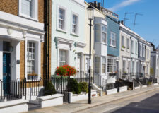
Specialist masonry and exterior woodwork paints come in a huge range of colours. So long as you’re not living in a conservation area where restrictions apply, consider the style of the brickwork or masonry of your home along with colours used on nearby buildings when selecting a paint.
Do you want to stand out, or blend in?
A brightly hued home might be an eyesore in a relatively monochrome street, but many areas (in parts of Hanover, for example) have rows of candy-coloured houses, where anything goes. If your taste edges towards the conservative, you can always pick out a brighter tone in door and woodwork colours. Technical advancements mean there are lots of smart exterior paints, too, with longer life spans and increased durability. Masonry paint comes in a wide variety of finishes, from textured to ultra-smooth. Opt for a texture if you need to disguise fine surface cracks. If you prefer traditional finishes, then consider old-fashioned limewash.
Colour & texture
Colour choice is as wide as your imagination. Many companies also offer a shade-matching service to help you get it right. When choosing colour, think about how you use a room, and how you want it to fit with the rest of your home. ‘Cool’ colours such as white, pale blues or greens will make a room feel larger, and ‘warm’ colours – pinks, reds or oranges – will make it feel cosy.
If you’re decorating a period property, then consider some of the ‘historic’ shades to match the period of your home. The Victorians loved crimsons and forest greens, and Georgian properties were typically decorated in shades of burgundy, Wedgewood blue, soft grey and dusky pink. For a contemporary feel, this season we’re loving retro colours and tones used in the mid-20th century – teal, saffron yellow, avocado green, and grey. Strong shades can be toned down by using them on just one or two walls to make a visual feature – paint the rest in a neutral off-white. Textured paint contains sand or silicone beads, and can be used to cover uneven surfaces. Alongside traditional Artex are some more contemporary textured paints that give a suede or velvet-like finish. Metallic and pearlised paints can be used to enhance light in a room or as a feature.